Logo Design for Transportation Company Savaar-E
Introduction
SAVAAR-E is envisioned as a forward-thinking mobility brand focused on innovation, sustainability, and next-generation transportation solutions. The logo was designed to reflect modern mobility, technological progress, and future connectivity. The objective was to create a strong visual identity that communicates trust, movement, and advancement while maintaining a clean and minimal design suitable for digital and physical applications.
Brand Challenge
The primary challenge was to design a logo that:
- Represents a mobility or transportation-based brand
- Reflects innovation and futuristic thinking
- Feels modern yet simple
- Works effectively across vehicles, apps, websites, and marketing materials
- Communicates reliability and forward motion
The brand name “SAVAAR-E” suggests ride, movement, or vehicle-based solutions. The tagline “Connecting Future” emphasizes technological integration and progressive development. The logo needed to visually align with these concepts without becoming overly complex.
Concept & Design Strategy
The logo design combines minimal typography with subtle symbolic elements to create a clean yet powerful brand mark.
1. Typography Focus
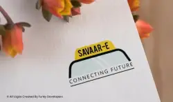
The wordmark “SAVAAR-E” is presented in bold uppercase lettering to project strength, confidence, and clarity. The use of uppercase letters enhances brand authority and improves visibility across different mediums.
The tagline “CONNECTING FUTURE” is placed below in a lighter, structured format. This creates a clear hierarchy:
- Brand Name – Primary Focus
- Tagline – Vision & Direction
This separation ensures readability and brand recall.
2. Symbolic Element – Vehicle Silhouette
A curved black line arches over the center of the design. This shape subtly resembles:
- A car roof
- A vehicle silhouette
- A mobility arc
- A connectivity bridge
Rather than using an obvious vehicle icon, the design opts for minimal symbolism. This makes the logo versatile and scalable while maintaining its mobility identity.
3. Color Psychology
The logo uses three primary tones:
Yellow
- Represents energy, innovation, and optimism
- Suggests electric mobility or clean energy
- Creates strong visual attention
Black
- Signifies strength, stability, and authority
- Enhances professionalism
- Provides contrast for high visibility
Soft Neutral Tone
- Adds balance
- Keeps the brand modern and clean
The yellow highlight at the top functions almost like a badge or signal indicator, subtly hinting at progress and movement.
Brand Positioning
SAVAAR-E positions itself as:
- A smart mobility solution provider
- A sustainable transport innovator
- A technology-integrated vehicle brand
- A future-ready transport ecosystem
The phrase “Connecting Future” reinforces digital integration—possibly app-based mobility, EV networks, ride-sharing platforms, or smart vehicle systems.
The design avoids clutter and heavy imagery, aligning with modern tech startups and EV brands that prioritize minimalism and scalability.
Versatility & Application
The logo is highly adaptable across multiple platforms:
Vehicle Branding
- Can be placed on EVs, fleet vehicles, delivery vans
Digital Platforms
- Mobile app icons
- Website headers
- Social media profiles
Print Media
- Business cards
- Brochures
- Hoardings
Merchandising
- Driver uniforms
- Charging stations
- Signage
Its clean structure ensures clarity even when resized, making it future-proof and scalable.
Impact & Outcome
The final logo successfully communicates:
- Movement
- Modern mobility
- Technological advancement
- Sustainable future orientation
It creates a balance between corporate reliability and startup innovation. The minimalist aesthetic enhances credibility while appealing to a tech-savvy audience.
SAVAAR-E now has a brand identity that:
- Reflects its vision
- Appeals to investors and customers
- Positions it competitively in the mobility sector
- Supports long-term brand expansion
Conclusion
The SAVAAR-E logo stands as a symbol of progress, connectivity, and forward movement. Through strategic typography, subtle symbolism, and meaningful color choices, the brand communicates its mission to connect the future of mobility.
The identity is simple, memorable, scalable, and aligned with modern transportation innovation—making it a strong foundation for a growing smart mobility enterprise.

Related Case Studies
Explore more success stories