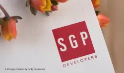
Logo Design for Real Estate / Property Development Company SGP Developers
Introduction
SGP Developers is positioned as a modern real estate development firm focused on delivering residential and commercial projects with quality, precision, and long-term value. The brand required a logo that reflected professionalism, reliability, and urban sophistication while remaining clean and timeless. The result is a bold, minimal identity centered around the initials “SGP” enclosed within a strong red square, accompanied by the word “Developers.”
This case study explores the strategic thinking, design direction, and impact of the SGP Developers logo.
The Challenge
In the competitive real estate industry, credibility and trust are everything. Buyers invest their life savings into property, and developers must communicate stability and authority instantly. The key challenge was to create a logo that:
- Communicates strength and reliability
- Feels modern and corporate
- Is easy to recognize and scalable
- Works across hoardings, brochures, site branding, and digital platforms
- Positions the company as premium yet approachable
The brand needed to stand out without being overly decorative or complex.
The Strategy
The branding strategy focused on minimalism and impact. Instead of using buildings, rooftops, or construction symbols (which are common in real estate logos), the design emphasizes strong typography and geometry.
The core idea was to:
- Use bold initials (SGP) to create memorability
- Enclose them in a solid geometric form to symbolize foundation and structure
- Apply a powerful color that represents confidence and leadership
This approach ensures that the logo feels corporate and scalable while maintaining visual strength.
Design Elements
1. The Red Square
The red square acts as the foundation of the identity. In real estate, foundation is symbolic of stability, strength, and permanence. The square shape conveys:
- Structural balance
- Trust
- Stability
- Professional integrity
Red as a color communicates power, confidence, and boldness. It attracts attention without being flashy and gives the brand a commanding presence in the market.
2. Typography – “SGP”
The initials are clean, bold, and sans-serif, reflecting:
- Modern development practices
- Urban projects
- Corporate reliability
- Forward-thinking mindset
Using initials rather than a full descriptive name creates a strong brand recall factor. It feels established and institutional—similar to large real estate groups that are recognized by acronyms.
3. Supporting Text – “Developers”
Placing “Developers” beneath the initials clarifies the industry positioning while maintaining hierarchy. The spacing and alignment reinforce:
- Clarity
- Order
- Simplicity
- Professional communication
This subtle typography balance ensures the logo works across business cards, site boards, brochures, and digital listings.
Brand Personality
The SGP Developers logo communicates:
- Confidence
- Authority
- Professionalism
- Urban sophistication
- Trustworthiness
It avoids unnecessary graphics, which enhances its premium appeal. The minimal style reflects a company that values structure, planning, and quality construction over decorative branding.
Versatility & Application
One of the strongest advantages of this logo is scalability. It performs effectively across:
- Construction site hoardings
- Project brochures
- Digital marketing creatives
- Website headers
- Property documentation
- Social media branding
- Corporate presentations
The bold red block ensures visibility even from a distance, which is critical for real estate marketing.
Market Positioning Impact
In real estate branding, perception drives sales. The SGP Developers logo positions the company as:
- A serious industry player
- A structured and stable organization
- A premium yet accessible developer
- A trustworthy investment partner
The clean, structured design builds psychological assurance for potential buyers and investors.
Conclusion
The SGP Developers logo demonstrates how simplicity can create strong market impact. By combining bold typography, geometric structure, and confident color psychology, the brand communicates authority and stability without unnecessary complexity.
In an industry where trust determines success, this logo effectively builds a visual foundation for long-term growth and brand recognition.

Related Case Studies
Explore more success stories