Logo Design for Textile Company Icon Texture
Overview
Icon Texture is positioned as a modern brand specializing in wall textures, decorative finishes, and surface solutions. The objective behind the logo design was to create a strong, versatile, and memorable brand identity that reflects innovation, durability, and aesthetic appeal. The brand needed a mark that would work effectively across packaging, marketing materials, product catalogs, dealer boards, and digital platforms.
The Challenge
The core challenge was to design a logo that:
- Represents the concept of “Texture” visually and conceptually
- Feels modern and industrial yet premium
- Is simple enough for product labeling and embossing
- Works in multiple color variations
- Stands out in the competitive construction and interior finishes market
Surface texture brands often lean toward either overly technical designs or overly decorative visuals. The goal for iCon Texture was to strike the right balance between strength and sophistication.
Design Strategy
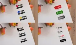
The logo centers around the wordmark “Icon Texture,” with special emphasis on the stylized “i” icon placed inside a geometric shape. This small icon functions as a symbolic mark that can stand independently on packaging, containers, or sample boards.
The use of:
- Bold sans-serif typography for “CON”
- Clean structured alignment
- Minimal icon detailing
creates a professional and industrial tone, making the brand feel reliable and construction-ready.
The split styling of “i” and “CON” subtly communicates individuality within strength — symbolizing innovative solutions within a strong structural framework.
Visual Language & Variations
One of the strongest aspects of the Icon Texture logo is its flexibility. The presented design shows multiple color variations including:
- Red (energy & boldness)
- Blue (trust & reliability)
- Green (eco-friendly & growth)
- Yellow (creativity & vibrancy)
- Black & White (minimal & professional)
This color adaptability makes the logo ideal for:
- Different product categories
- Interior vs exterior finishes
- Premium vs economy product lines
- Dealer-based branding customization
The monochrome version ensures the brand maintains clarity when printed on textured materials, embossed surfaces, metal containers, or laser-cut signage.
Symbolism
The geometric icon behind the “i” resembles a tile or surface block — subtly reinforcing the concept of texture and material surfaces. The sharp edges communicate precision, while the rounded typography softens the industrial look, making the brand approachable.
The word “Texture” placed in a clean rectangular strip anchors the design and gives it a solid base, reflecting stability and foundation — key qualities in construction and interior finishing industries.
Market Positioning Impact
The Icon Texture logo positions the brand as:
- Modern and innovative
- Reliable and technically sound
- Premium yet accessible
- Suitable for architects, contractors, and interior designers
In a market where visual presentation plays a key role in purchase decisions, especially for wall finishes and decorative materials, a strong logo builds immediate trust.
The flexibility of the logo across digital and print media ensures that the brand can scale — from local dealership boards to national distribution packaging.
Brand Strength & Scalability
A major advantage of this identity is its scalability. The compact icon can be used as:
- A product stamp
- Social media favicon
- App icon (if the company expands digitally)
- Embossed brand mark on texture samples
This modular branding approach supports long-term growth.
Conclusion
The Icon Texture logo successfully blends industrial strength with modern minimalism. It communicates innovation without unnecessary complexity and maintains high adaptability across mediums. The thoughtful use of typography, geometric symbolism, and color variations ensures the brand remains versatile, professional, and market-ready.
Overall, the identity builds a strong foundation for a texture and surface solutions company aiming to establish credibility, visibility, and long-term brand recall in the construction and interior finishing industry.
Related Case Studies
Explore more success stories