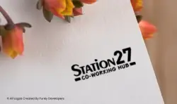
Logo Design for co-working space / shared office space company Station 27
Introduction
Station27 – Co-Working Hub was conceptualized as a modern, dynamic workspace designed for startups, freelancers, entrepreneurs, and growing businesses. The brand needed a logo that communicated flexibility, collaboration, professionalism, and urban energy. The identity had to appeal to a new generation of professionals while maintaining credibility for corporate clients.
The primary goal was to create a clean, memorable, and scalable logo that reflects a modern co-working ecosystem.
Brand Challenge
The co-working industry is highly competitive, with brands often using overcomplicated icons such as buildings, desks, Wi-Fi signals, or abstract human figures. Station27 wanted to stand out with:
- A bold and minimal identity
- A name-focused brand presence
- A professional yet creative personality
- A logo adaptable across signage, digital platforms, and merchandise
The challenge was to create a strong typographic identity that feels premium, modern, and versatile without relying heavily on graphic symbols.
Concept Development
The name “Station27” inspired the foundation of the logo concept.
“Station” represents a hub — a place where people gather, connect, and move forward. It symbolizes opportunity, growth, and transition.
“27” adds uniqueness and memorability, making the brand distinct and easy to recall.
Instead of cluttering the identity with icons, the strategy focused on strong typography to establish authority and clarity.
Design Strategy
1. Bold Typography
The logo uses clean, bold, sans-serif typography to reflect:
- Stability
- Modern architecture
- Business professionalism
- Confidence
The slightly dynamic styling of “Station27” gives a forward-moving feel, symbolizing growth and momentum — essential qualities for entrepreneurs and startups.
2. Emphasis on “27”
The number “27” is highlighted within the name, giving the brand a unique anchor point. It becomes a conversation starter and a branding element that can be used independently for:
- Interior wall branding
- Merchandise
- Social media campaigns
- Event branding
3. Subtext: Co-Working Hub
The tagline “Co-Working Hub” is placed below the main name in a smaller, balanced typeface. This ensures clarity of service while keeping the primary focus on the brand name.
The minimal underline strokes add structure and subtle visual balance without overpowering the typography.
Visual Identity Impact
The final logo achieves several strategic objectives:
- Clean and modern look
- High scalability (works in small favicon sizes and large signage formats)
- Excellent readability
- Professional corporate appeal
- Startup-friendly aesthetic
The monochrome black version enhances adaptability across different backgrounds, interiors, glass panels, and marketing materials.
Brand Application Potential
The Station27 logo is designed to be highly versatile. It can be effectively applied across:
- Office reception signage
- Glass partitions
- Business cards
- Website headers
- Social media branding
- Member access cards
- Workspace merchandise
The simplicity of the design ensures that it maintains elegance whether embossed, printed, engraved, or displayed digitally.
Business Positioning
The logo successfully positions Station27 as:
- A premium co-working destination
- A professional business environment
- A collaborative innovation hub
- A growth-focused workspace
By avoiding overly decorative elements, the brand signals maturity and reliability — qualities important for attracting both startups and established companies.
Conclusion
The Station27 – Co-Working Hub logo exemplifies the power of simplicity and strategic typography. It communicates professionalism, modernity, and forward momentum without unnecessary visual noise.
The final identity reflects the core philosophy of co-working spaces: connection, collaboration, and growth. Through clean design and strong branding, Station27 establishes itself as a trusted and contemporary workspace solution for ambitious professionals.

Related Case Studies
Explore more success stories